If you’re into kitesurfing or windsurfing, Windguru is an essential tool to forecast the wind and find the best time for your sessions. But how does Windguru actually work? How are the wind data calculated, and how often is the forecast updated? In this blog, I’ll explain where Windguru gets its data from and how to read it properly.
What is Windguru and where does it get its data from?
Windguru is a specialized weather tool that provides wind, wave, and weather forecasts for watersports enthusiasts. But how exactly does Windguru get its data?
Model-based calculations: Windguru uses numerical weather prediction models like GFS (Global Forecast System) and WRF (Weather Research and Forecasting). These models collect data from satellites, weather stations, and various measuring devices to create precise forecasts. They take into account atmospheric conditions to calculate how wind and weather will evolve.
Data sources: The data Windguru relies on comes from global weather stations, satellite measurements, and ocean models, which are updated in real-time. This data is then fed into the forecast models to produce accurate calculations for wind speed, direction, and wave height.
How often is Windguru updated?
Windguru is regularly updated to make sure you’re getting the most accurate information possible:
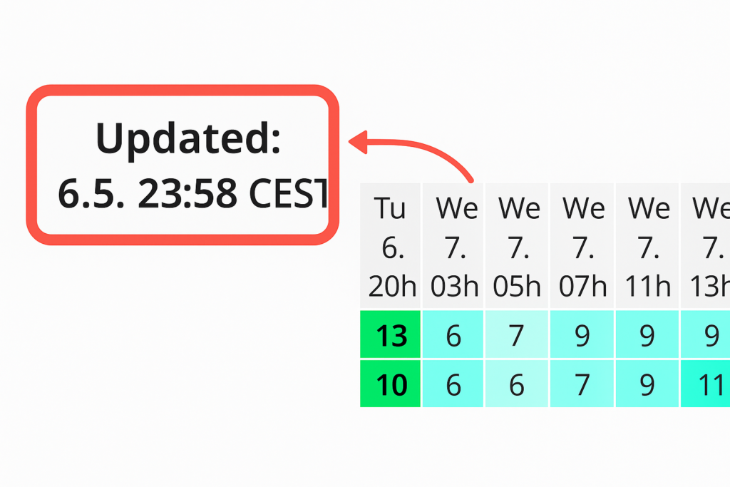
Update times: Windguru updates every 6 hours. This means you’ll consistently get fresh data based on the latest weather conditions. You can always see the last update time displayed at the top of the page to know how current the forecast is.
Why Windguru?
I use Windguru because it’s incredibly accurate when it comes to predicting wind direction and strength. Especially for us kitesurfers, it’s crucial to know exactly how strong the wind will be and from which direction it’s coming. Windguru offers:
Very detailed forecasts for specific spots.
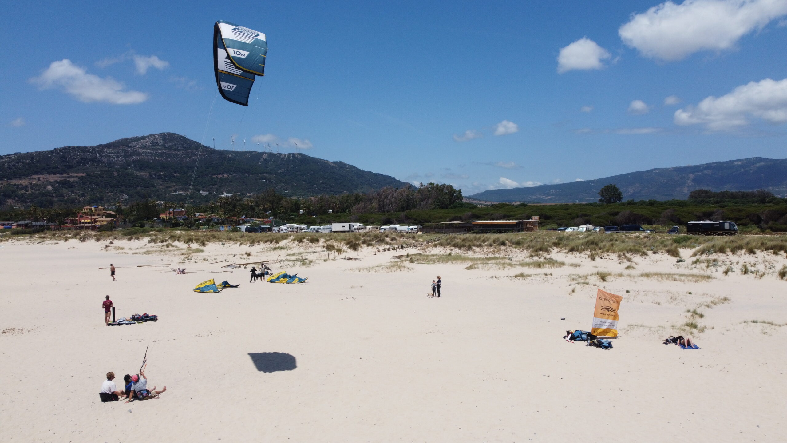
Exact wind direction and wind strength, which help me choose the best time for kitesurfing at my school in Tarifa.
Easy-to-understand visual graphs that make reading the wind data simple.
Stats: Which wind forecast tools are the most used?
To give you a better idea of how popular Windguru is, here’s a quick stat:
Windguru is one of the most-used wind forecast tools worldwide, especially in the kitesurfing and windsurfing community. According to SimilarWeb, it’s one of the leading platforms with millions of users around the world.
Source: SimilarWeb Report – Windguru Traffic
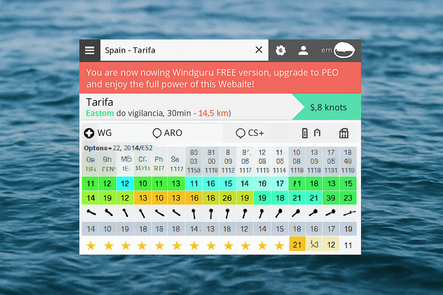
How to read Windguru – Step by Step
When you open Windguru, you’ll see a table with lots of rows. Here’s how to read and understand each one:
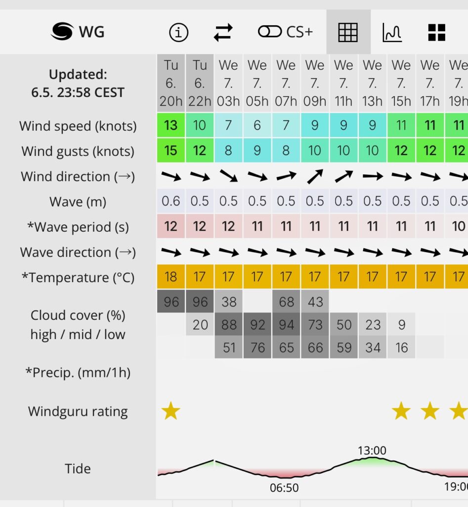
Rows 1–3: Day/Date/Time
These rows show the date, day of the week, and time the forecast refers to.
Rows 4–5: Wind Speed and Gusts (in knots)
Row 4 – Wind Speed: Shows the average wind speed in knots, calculated over a specific time period. This gives you an idea of how strong the wind will be during your session on average.
Row 5 – Wind Gusts: Shows the maximum wind speeds (gusts) that may occur in the same time period. Gusts are important for understanding how inconsistent or powerful the wind can get in short bursts.
Row 6: Wind Direction
Wind direction arrow – what it means:
Windguru shows where the wind is going, not where it’s coming from.
← Levante (East wind): The wind comes from the east – side-offshore in Tarifa.
→ Poniente (West wind): The wind comes from the west – side-onshore in Tarifa.
More examples:
↑ South wind: Comes from the south, usually onshore in Tarifa – good only for experienced riders.
↓ North wind: Comes from the north, often offshore in Tarifa – not ideal for kitesurfing.
↘️ Northwest wind and ↖️ Southeast wind: Come from intermediate directions
Summary of arrow meanings:
↑ South wind
↓ North wind
← East wind (Levante – side-offshore)
→ West wind (Poniente – side-onshore)
↗️ Southwest wind
↖️ Southeast wind
↘️ Northwest wind
↙️ Northeast wind
Rows 7–9: Wave Height, Period & Direction
Wave Height (row 7): Average height of the waves in meters.
Wave Period (row 8): Time interval between two waves (in seconds). Longer periods = more energy = cleaner swells.
Wave Direction (row 9): Shows where the waves are coming from.
→ West swell
← East swell
↑ South swell
↓ North swell
Row 10: Temperature
This shows the air temperature in °C, not the water temperature. It gives you a sense of the general weather conditions.
Row 11–13: Cloud Cover
High Clouds (row 11): Cloud cover at high altitude – usually doesn’t affect wind.
Mid Clouds (row 12): These can affect thermic wind generation.
Low Clouds (row 13): Low clouds can block sunlight and reduce thermal effects, which often weakens the wind.
Row 14: Rain in mm/hour
Shows how much rain (in mm) is expected per hour. 1 mm/hour is light rain, while higher values indicate heavier rain – good to know when deciding whether to go out in wet weather.
Row 15: Windguru Rating
This is Windguru’s own quality rating of the wind conditions:
1 star = poor (too weak or inconsistent)
5 stars = excellent (ideal strength and stability)
A great quick reference to spot good days! Windguru gives a lot of stars to very strong forecasts, which doesn’t always mean the best conditions for an amateur kitesurfer.
Row 16: Tides (Low/High Tide)
This row tells you whether it will be low tide or high tide. Tides can have a big impact on wind, especially in coastal areas like Tarifa, where the wind often gets stronger during a rising tide.
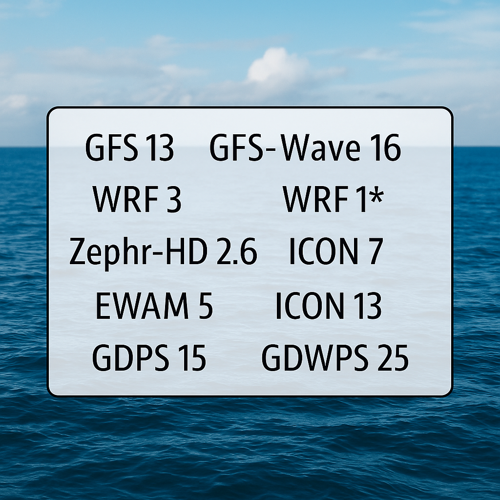
Forecast Models Used by Windguru – Row 17
This row shows you the different models Windguru is using to generate the forecast. Each model has a different resolution and coverage. Here are the most important ones:
-
GFS 13: Global model, 13 km resolution – good for long-term forecasts.
-
GFS-Wave 16: Wave forecast model, 16 km resolution.
-
WRF 3: Local model, 3 km resolution – more accurate for specific areas.
-
WRF 1*: Highly detailed local model, 1 km resolution.
-
Zephr-HD 2.6: Wind & wave model with 2.6 km resolution.
-
WRF 9: 9 km resolution – good for wider regions.
-
ICON 7: European model, 7 km resolution.
-
EWAM 5: European wave model, 5 km resolution.
-
ICON 13: Larger scale model, 13 km resolution.
-
GDPS 15: Canadian global model, 15 km resolution.
-
GDWPS 25: Canadian wave model, 25 km resolution.
Conclusion
With this step-by-step guide, you now understand what each row in Windguru means – from the date and wind speed to update times and forecast models like GFS or WRF.
Windguru is an essential tool for kitesurfers. It helps you interpret the wind and find the best conditions for your next adventure. With frequent updates and precise data, you can count on Windguru to give you one of the most reliable forecasts out there.
Pro Tip:
It’s always smart to compare Windguru with a second forecast. I always use the Windy app alongside Windguru. On Windy, I can view a map showing the exact wind direction and strength without relying on the arrow system. This makes it much easier to double-check the forecast and make sure I’m picking the best possible conditions for my session!